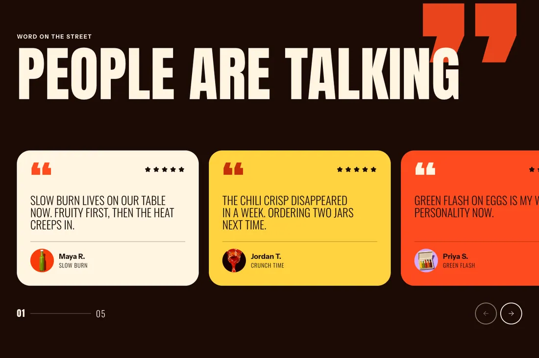
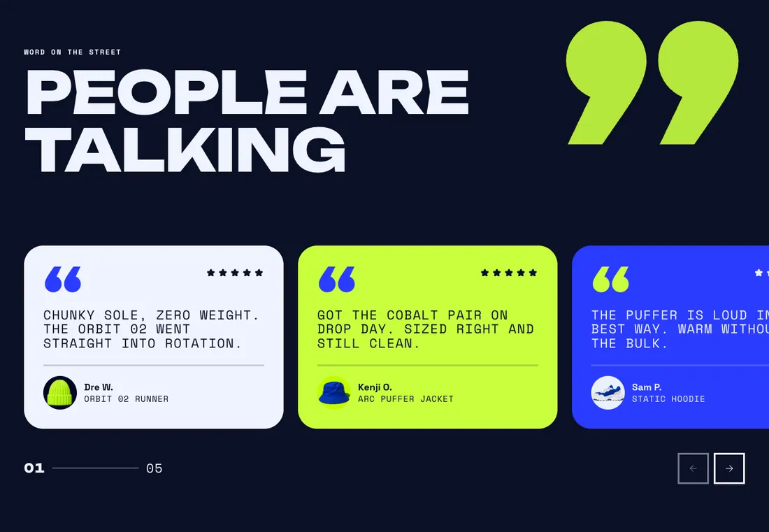
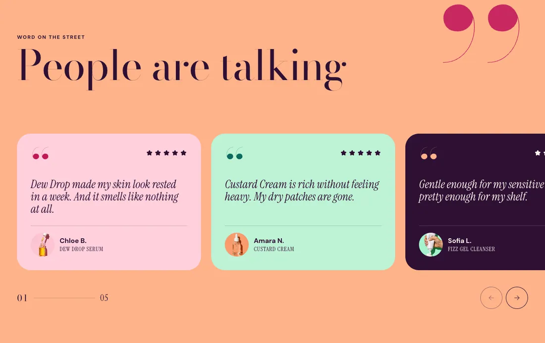
Quote cards as an auto-scrolling drag carousel, grid or masonry, with ratings.
The same section in the three themes:
Picante style Overdrive style Pastille style Where to find it: In the theme editor, choose Add section on any template, then pick Testimonials .
The heading area is a static block named Section header . Select it in the section sidebar to edit the eyebrow, heading, text and buttons, or to restyle or reorder them.
When you add this section, you can start from these presets: Testimonials , Customer reviews .
Setting
Type
Default
Options
Notes
Show giant quotation mark
Checkbox
On
A large accent-color quote mark drifts behind the header as the page scrolls.
Setting
Type
Default
Options
Notes
Layout
Select
Carousel
Carousel, Grid, Staggered grid
Card width
Select
Medium
Small, Medium, Large
Shown when Layout is Carousel.
Columns on desktop
Slider
3
2 to 4, step 1
Shown when Layout is not Carousel.
Gap
Slider
24 px
8 to 48 px, step 4
Show arrows
Checkbox
On
Shown when Layout is Carousel.
Show slide count
Checkbox
On
Shown when Layout is Carousel.
Auto-scroll slowly
Checkbox
Off
Pauses on hover, focus and touch, and adds a pause button. Stops when a customer reduces motion. Shown when Layout is Carousel.
Speed
Slider
30 px
10 to 100 px, step 10
Shown when Layout is Carousel and Auto-scroll slowly is on.
Setting
Type
Default
Options
Notes
Color scheme
Color scheme
Scheme 3
Layout width
Select
Page width
Page width, Full width
Animation on scroll
Select
Theme default
Theme default, None, Fade, Slide up, Scale in, Wipe, Blur in
Top padding
Slider
80 px
0 to 200 px, step 8
Bottom padding
Slider
80 px
0 to 200 px, step 8
Add, reorder, duplicate or remove these blocks in the section sidebar: Section header , Testimonial .
This section holds up to 24 blocks.
Setting
Type
Default
Options
Notes
Layout
Select
Stacked
Stacked, Split: content left, button right
Alignment
Select
Left
Left, Center, Right
Shown when Layout is Stacked.
Max width
Select
None
None, Narrow, Normal
Gap
Slider
12 px
0 to 64 px, step 4
Space below
Slider
48 px
0 to 120 px, step 4
Animation on scroll
Select
None
Theme default, None, Fade, Slide up, Scale in, Wipe, Blur in
Setting
Type
Default
Options
Notes
Quote
Rich text
Add a quote from a happy customer. Short, specific quotes are the most convincing.
Author
Text
Customer name
Author detail
Text
Location or product
Author photo
Image
Star rating
Slider
5
0 to 5, step 1
Set to 0 to hide the stars.
Setting
Type
Default
Options
Notes
Text style
Select
Heading 5
Body, Intro text, Heading 6, Heading 5, Heading 4, Heading 3
Text color
Select
Color scheme text
Color scheme text, Accent, Custom
Custom text color
Color
Shown when Text color is Custom.
Alignment
Text alignment
left
Left, center, right
Setting
Type
Default
Options
Notes
Inherit color scheme
Checkbox
Off
Color scheme
Color scheme
Scheme 1
Shown when Inherit color scheme is off.
Corner radius
Slider
32 px
0 to 80 px, step 2
Border
Select
None
None, Solid, Dashed
Border thickness
Slider
2 px
1 to 8 px, step 1
Shown when Border is not None.
Setting
Type
Default
Options
Notes
Customize padding
Checkbox
Off
Padding settings stay visible while any side has padding. Set a side to 0px to remove its padding.
Top padding
Slider
32 px
0 to 100 px, step 2
Shown when Customize padding is on or Top padding is on or Bottom padding is on or Left padding is on or Right padding is on.
Bottom padding
Slider
32 px
0 to 100 px, step 2
Shown when Customize padding is on or Top padding is on or Bottom padding is on or Left padding is on or Right padding is on.
Left padding
Slider
32 px
0 to 100 px, step 2
Shown when Customize padding is on or Top padding is on or Bottom padding is on or Left padding is on or Right padding is on.
Right padding
Slider
32 px
0 to 100 px, step 2
Shown when Customize padding is on or Top padding is on or Bottom padding is on or Left padding is on or Right padding is on.
Setting
Type
Default
Options
Notes
Tilt toward the pointer
Checkbox
On
The card leans slightly in 3D on hover. Stops when a customer reduces motion.
Animation on scroll
Select
Theme default
Theme default, None, Fade, Slide up, Scale in, Wipe, Blur in