Product recommendations section
Related products on the product page, loaded after render.
The same section in the three themes:
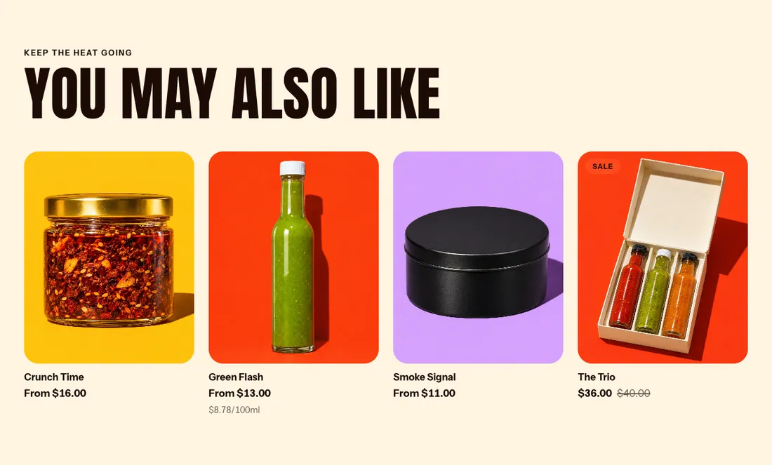

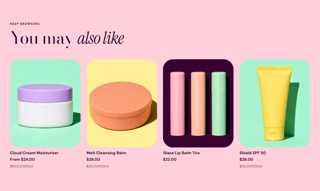
Where to find it: In the theme editor, choose Add section on any template, then pick Product recommendations.
The heading area is a static block named Section header. Select it in the section sidebar to edit the eyebrow, heading, text and buttons, or to restyle or reorder them.
When you add this section, it starts from the Product recommendations preset.
Settings
Section titled “Settings”Shopify generates recommendations and improves them as your store gets orders. Set complementary products in the Search and Discovery app.
| Setting | Type | Default | Options | Notes |
|---|---|---|---|---|
| Type | Select | Related products | Related products, Complementary products | The section hides itself when there is nothing to recommend. |
| Products to show | Slider | 4 | 2 to 10, step 1 |
Layout
Section titled “Layout”| Setting | Type | Default | Options | Notes |
|---|---|---|---|---|
| Layout | Select | Grid | Grid, Carousel | |
| Columns on desktop | Slider | 4 | 2 to 6, step 1 | |
| Image ratio | Select | Use theme setting | Use theme setting, Adapt to image, Portrait (4:5), Square (1:1), Landscape (4:3) |
Section style
Section titled “Section style”| Setting | Type | Default | Options | Notes |
|---|---|---|---|---|
| Color scheme | Color scheme | Scheme 1 | ||
| Layout width | Select | Page width | Page width, Full width | |
| Animation on scroll | Select | Theme default | Theme default, None, Fade, Slide up, Scale in, Wipe, Blur in | |
| Top padding | Slider | 80 px | 0 to 200 px, step 8 | |
| Bottom padding | Slider | 80 px | 0 to 200 px, step 8 |
Blocks
Section titled “Blocks”Add, reorder, duplicate or remove these blocks in the section sidebar: Section header.
Section header block settings
Section titled “Section header block settings”| Setting | Type | Default | Options | Notes |
|---|---|---|---|---|
| Layout | Select | Stacked | Stacked, Split: content left, button right | |
| Alignment | Select | Left | Left, Center, Right | Shown when Layout is Stacked. |
| Max width | Select | None | None, Narrow, Normal | |
| Gap | Slider | 12 px | 0 to 64 px, step 4 | |
| Space below | Slider | 48 px | 0 to 120 px, step 4 | |
| Animation on scroll | Select | None | Theme default, None, Fade, Slide up, Scale in, Wipe, Blur in |