Story panels section
Pinned storytelling: vertical scroll drives a horizontal row of panels, with a progress bar.
The same section in the three themes:
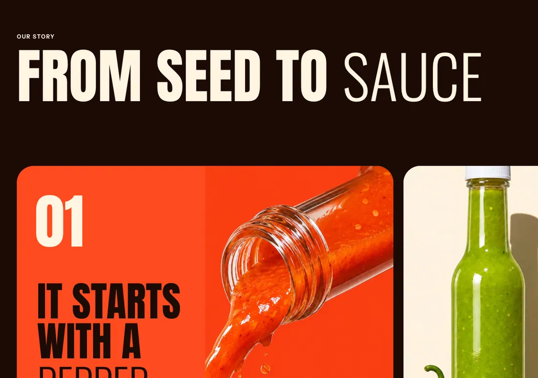
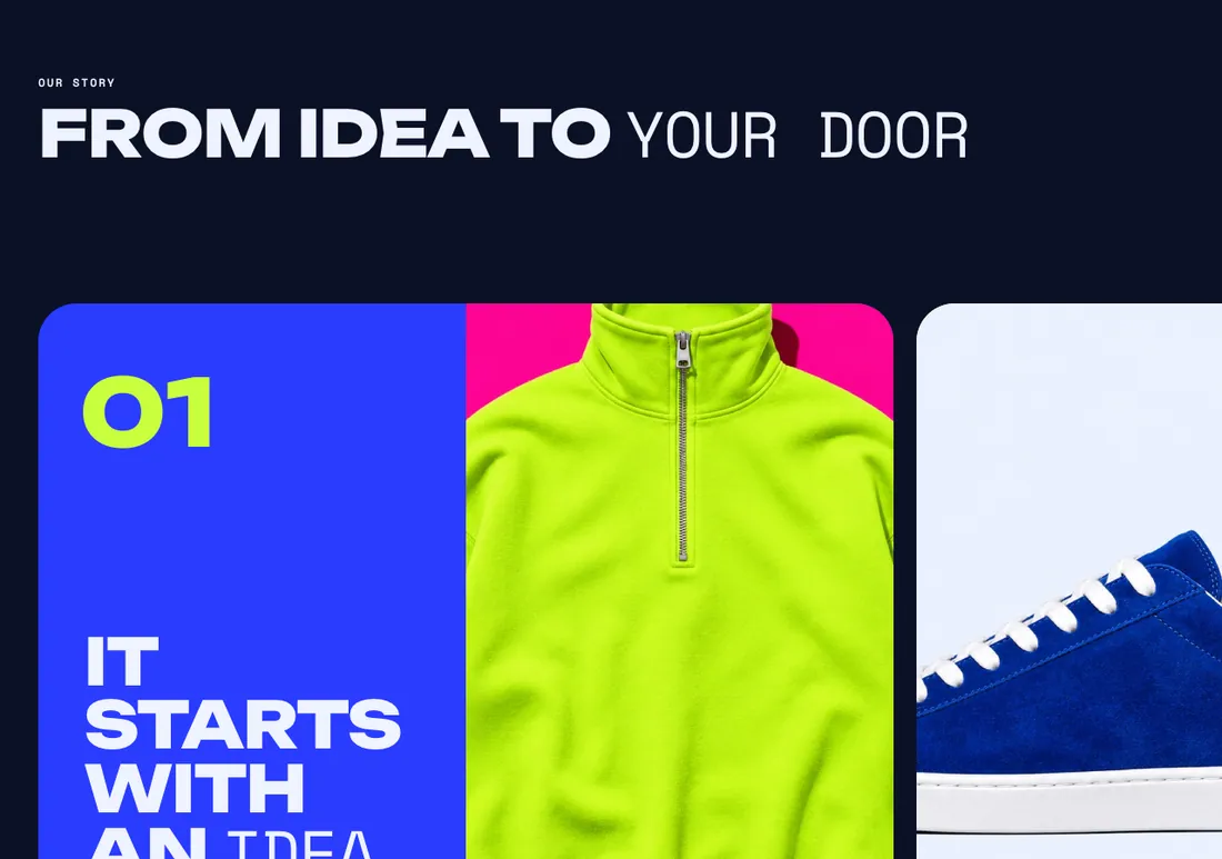
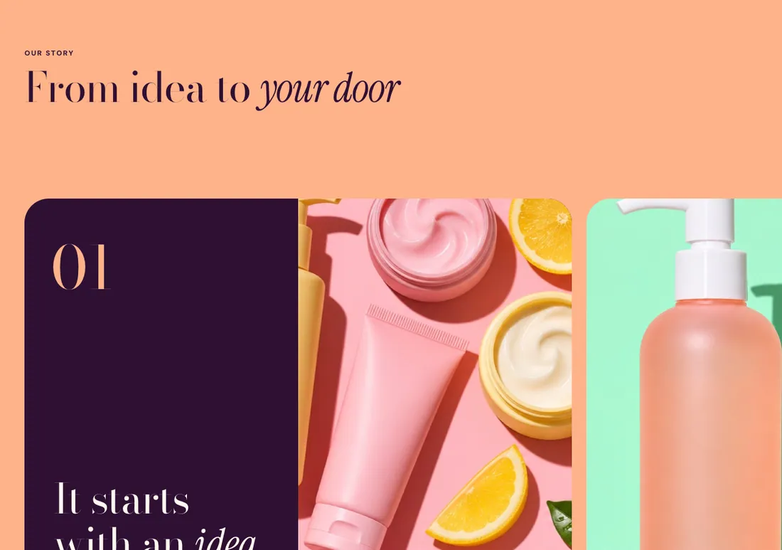
Where to find it: In the theme editor, choose Add section on any template, then pick Story panels.
The heading area is a static block named Section header. Select it in the section sidebar to edit the eyebrow, heading, text and buttons, or to restyle or reorder them.
When you add this section, it starts from the Story panels preset.
Settings
Section titled “Settings”Scrolling
Section titled “Scrolling”| Setting | Type | Default | Options | Notes |
|---|---|---|---|---|
| Pin and scroll sideways | Checkbox | On | On desktop the section sticks while the panels travel sideways as the page scrolls. On touch screens, small screens and with motion off it becomes a swipeable row. | |
| Scroll length | Slider | 100 % | 50 to 200 %, step 10 | Higher values make the panels travel more slowly. Shown when Pin and scroll sideways is on. |
| Drift images on scroll | Checkbox | On | Images and numbers drift at a different speed while pinned. Shown when Pin and scroll sideways is on. | |
| Show progress bar | Checkbox | On |
Panels
Section titled “Panels”| Setting | Type | Default | Options | Notes |
|---|---|---|---|---|
| Width on desktop | Slider | 70 % | 40 to 100 %, step 5 | |
| Width on mobile | Slider | 85 % | 60 to 100 %, step 5 | |
| Minimum height | Slider | 70 % | 40 to 100 %, step 5 | Share of the screen height. Pinned panels always fill the screen. |
| Gap | Slider | 24 px | 0 to 80 px, step 4 | |
| Corner radius | Slider | 40 px | 0 to 80 px, step 4 | |
| Show numbers | Checkbox | On |
Section style
Section titled “Section style”| Setting | Type | Default | Options | Notes |
|---|---|---|---|---|
| Color scheme | Color scheme | Scheme 3 | ||
| Layout width | Select | Page width | Page width, Full width | |
| Animation on scroll | Select | Theme default | Theme default, None, Fade, Slide up, Scale in, Wipe, Blur in | |
| Top padding | Slider | 80 px | 0 to 200 px, step 8 | |
| Bottom padding | Slider | 80 px | 0 to 200 px, step 8 |
Blocks
Section titled “Blocks”Add, reorder, duplicate or remove these blocks in the section sidebar: Section header, Story panel.
This section holds up to 8 blocks.
Section header block settings
Section titled “Section header block settings”| Setting | Type | Default | Options | Notes |
|---|---|---|---|---|
| Layout | Select | Stacked | Stacked, Split: content left, button right | |
| Alignment | Select | Left | Left, Center, Right | Shown when Layout is Stacked. |
| Max width | Select | None | None, Narrow, Normal | |
| Gap | Slider | 12 px | 0 to 64 px, step 4 | |
| Space below | Slider | 48 px | 0 to 120 px, step 4 | |
| Animation on scroll | Select | None | Theme default, None, Fade, Slide up, Scale in, Wipe, Blur in |
Story panel block settings
Section titled “Story panel block settings”| Setting | Type | Default | Options | Notes |
|---|---|---|---|---|
| Layout | Select | Image beside text | Image beside text, Image behind text, Text only | |
| Image | Image | Shown when Layout is not Text only. | ||
| Media position | Select | Right | Left, Right | Shown when Layout is Image beside text. |
| Overlay opacity | Slider | 40 % | 0 to 90 %, step 5 | Tints the image with the panel background color so text stays readable. Shown when Layout is Image behind text. |
| Vertical alignment | Select | Bottom | Top, Middle, Bottom | Bottom places the number at the top and the content at the bottom. |
Colors and border
Section titled “Colors and border”| Setting | Type | Default | Options | Notes |
|---|---|---|---|---|
| Color scheme | Color scheme | Scheme 2 |