Skip to content

Content grid section

Your theme

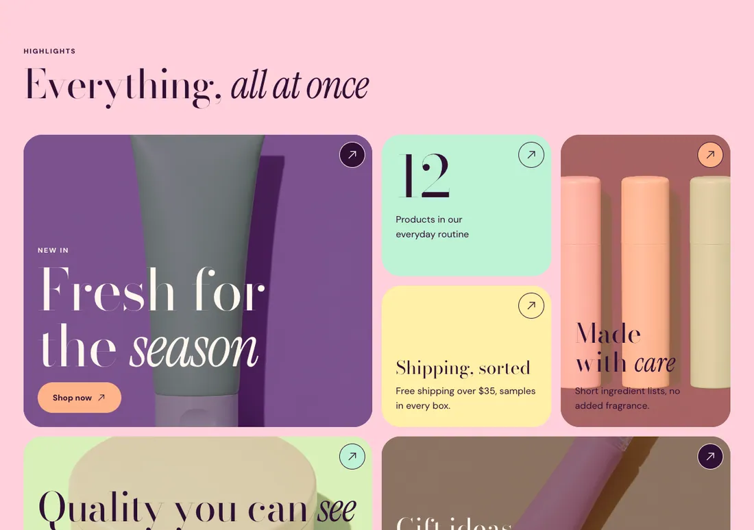
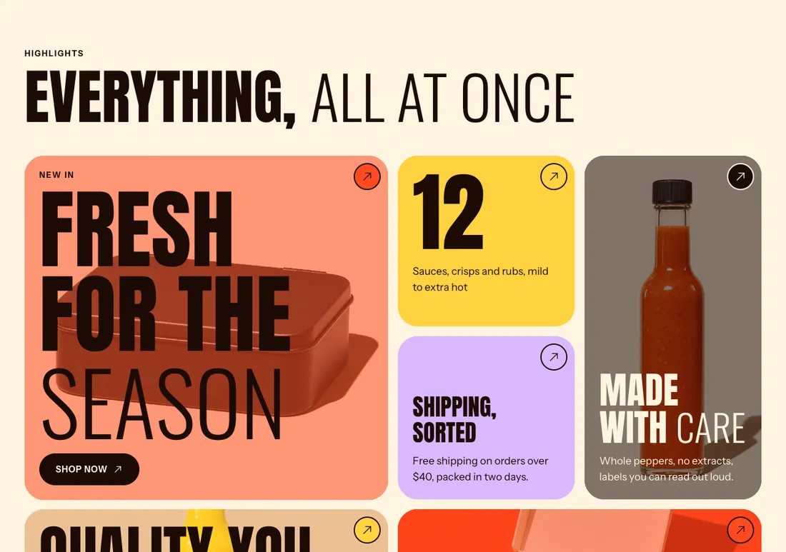
Dense bento grid of color tiles (small, wide, tall, large) with image or video backgrounds and hover tilt / lift / zoom.

The same section in the three themes:

Where to find it: In the theme editor, choose Add section on any template, then pick Content grid.

The heading area is a static block named Section header. Select it in the section sidebar to edit the eyebrow, heading, text and buttons, or to restyle or reorder them.

When you add this section, it starts from the Content grid preset.

Setting Type Default Options Notes
Columns on desktop Slider 4 3 to 6, step 1 Tablets show up to 4 columns.
Columns on mobile Select 2 columns 1 column, 2 columns
Minimum tile height Slider 240 px 120 to 400 px, step 10 Height of a small tile. Tall and large tiles span two rows.
Gap Slider 16 px 0 to 48 px, step 2
Corner radius Slider 32 px 0 to 80 px, step 4
Tile padding Slider 24 px 8 to 64 px, step 4
Fill gaps automatically Checkbox On Moves smaller tiles up into empty cells. Turn off to keep the exact block order.
Drift images on scroll Checkbox Off Tile images and videos drift slightly as the page scrolls.
Setting Type Default Options Notes
Color scheme Color scheme Scheme 1
Layout width Select Page width Page width, Full width
Animation on scroll Select Theme default Theme default, None, Fade, Slide up, Scale in, Wipe, Blur in
Top padding Slider 80 px 0 to 200 px, step 8
Bottom padding Slider 80 px 0 to 200 px, step 8

Add, reorder, duplicate or remove these blocks in the section sidebar: Section header, Tile.

This section holds up to 16 blocks.

Setting Type Default Options Notes
Layout Select Stacked Stacked, Split: content left, button right
Alignment Select Left Left, Center, Right Shown when Layout is Stacked.
Max width Select None None, Narrow, Normal
Gap Slider 12 px 0 to 64 px, step 4
Space below Slider 48 px 0 to 120 px, step 4
Animation on scroll Select None Theme default, None, Fade, Slide up, Scale in, Wipe, Blur in
Setting Type Default Options Notes
Size Select Small (1 × 1) Small (1 × 1), Wide (2 × 1), Tall (1 × 2), Large (2 × 2)
Vertical alignment Select Bottom Top, Middle, Bottom
Setting Type Default Options Notes
Image Image
Video Video Replaces the image. Plays muted while the tile is on screen, with a pause button.
Show placeholder image Checkbox Off Previews the layout with a sample image until you select an image or video. Customers see the sample image too, so add your own before you publish. Shown when Image is on and Video is on.
Overlay opacity Slider 30 % 0 to 90 %, step 5 Tints the image or video with the tile background color so text stays readable.
Setting Type Default Options Notes
Link Link
Link label for screen readers Text Describes where the tile leads, for example “Shop gift sets”.
Setting Type Default Options Notes
Color scheme Color scheme Scheme 2
Setting Type Default Options Notes
Hover effect Select Zoom None, Zoom, Lift, Tilt
Animation on scroll Select Scale in Theme default, None, Fade, Slide up, Scale in, Wipe, Blur in