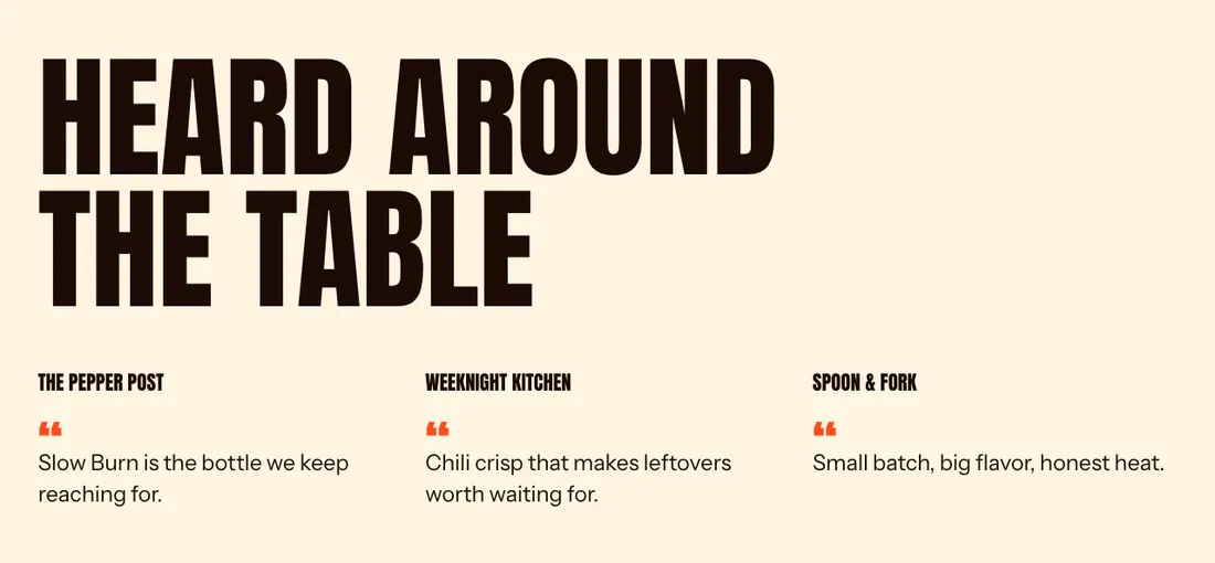
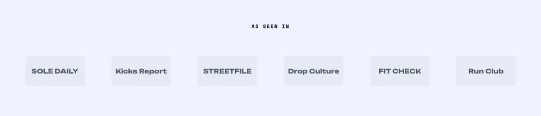
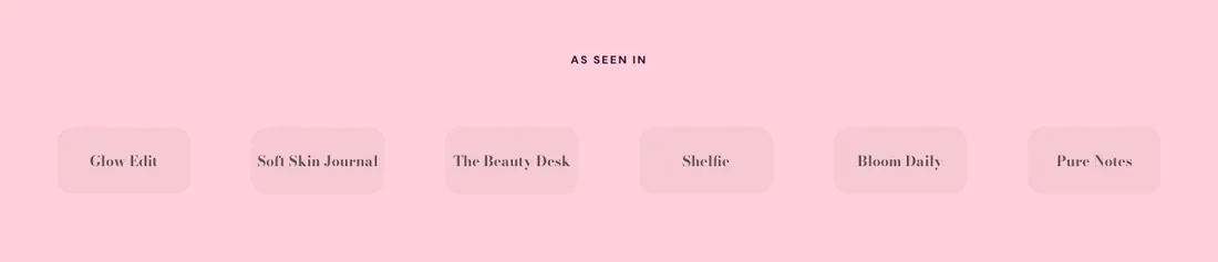
Logos as a grid or a ticker, optional monochrome.
The same section in the three themes:
Picante style Overdrive style Pastille style Where to find it: In the theme editor, choose Add section on any template, then pick Logo list .
The heading area is a static block named Section header . Select it in the section sidebar to edit the eyebrow, heading, text and buttons, or to restyle or reorder them.
When you add this section, you can start from these presets: Logo list , Logo marquee , Press coverage .
Setting
Type
Default
Options
Notes
Layout
Select
Grid
Grid, Marquee, Press quotes
Add press quote blocks. Each has a logo, the publication name and a short quote.
Setting
Type
Default
Options
Notes
Style
Select
Row
Row, Carousel
Shown when Layout is Press quotes.
Columns on desktop
Slider
3
1 to 4, step 1
Shown when Layout is Press quotes.
Quote position
Select
Under the logo
Under the logo, Beside the logo
Shown when Layout is Press quotes.
Quote size
Select
Medium
Small, Medium, Large
Shown when Layout is Press quotes.
Style
Select
Plain
Plain, Outlined cells, Tiles
Size
Slider
140 px
60 to 240 px, step 10
Columns on desktop
Slider
6
3 to 8, step 1
Shown when Layout is Grid.
Columns on mobile
Slider
3
2 to 4, step 1
Shown when Layout is Grid.
Black and white logos
Checkbox
On
Logos turn gray and show their colors on hover.
Setting
Type
Default
Options
Notes
Speed
Slider
40
10 to 100, step 5
Shown when Layout is Marquee.
Direction
Select
Left
Left, Right
Shown when Layout is Marquee.
Pause on hover
Checkbox
On
Shown when Layout is Marquee.
Fade the edges
Checkbox
On
Shown when Layout is Marquee.
Setting
Type
Default
Options
Notes
Color scheme
Color scheme
Scheme 1
Layout width
Select
Page width
Page width, Full width
Animation on scroll
Select
Theme default
Theme default, None, Fade, Slide up, Scale in, Wipe, Blur in
Top padding
Slider
56 px
0 to 200 px, step 8
Bottom padding
Slider
56 px
0 to 200 px, step 8
Add, reorder, duplicate or remove these blocks in the section sidebar: Section header , Logo , Press quote .
This section holds up to 25 blocks.
Setting
Type
Default
Options
Notes
Layout
Select
Stacked
Stacked, Split: content left, button right
Alignment
Select
Left
Left, Center, Right
Shown when Layout is Stacked.
Max width
Select
None
None, Narrow, Normal
Gap
Slider
12 px
0 to 64 px, step 4
Space below
Slider
48 px
0 to 120 px, step 4
Animation on scroll
Select
None
Theme default, None, Fade, Slide up, Scale in, Wipe, Blur in
Setting
Type
Default
Options
Notes
Image
Image
Link
Link
Scale
Slider
100 %
40 to 200 %, step 10
Adjusts this logo against the section’s logo size.
Setting
Type
Default
Options
Notes
Animation on scroll
Select
Theme default
Theme default, None, Fade, Slide up, Scale in, Wipe, Blur in
Setting
Type
Default
Options
Notes
Logo
Image
Publication name
Text
Publication name
Describes the logo for screen readers and shows when there is no logo.
Quote
Text area
Add a short line the publication wrote about you.
Keep it to a sentence or two.
Link
Link
Scale
Slider
100 %
40 to 200 %, step 10
Adjusts this logo against the section’s logo size.
Setting
Type
Default
Options
Notes
Animation on scroll
Select
Theme default
Theme default, None, Fade, Slide up, Scale in, Wipe, Blur in