Collection list section
Collections as tiles, a bento layout or a giant text index with a pointer-following image.
The same section in the three themes:
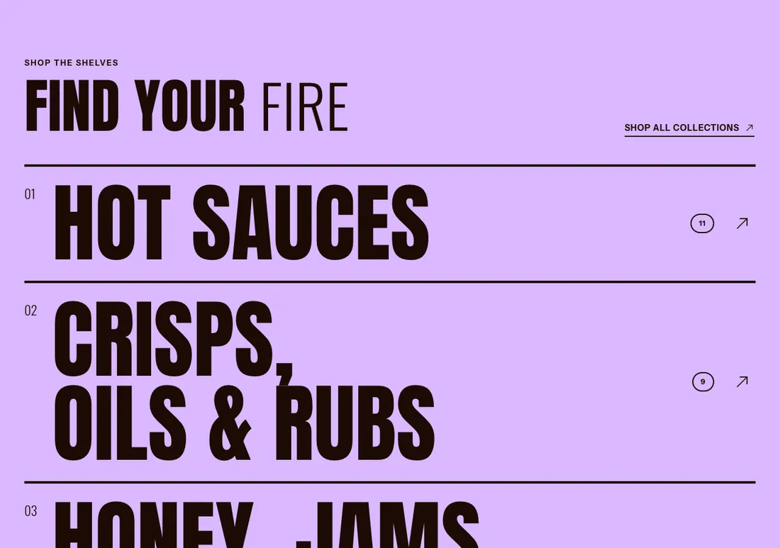
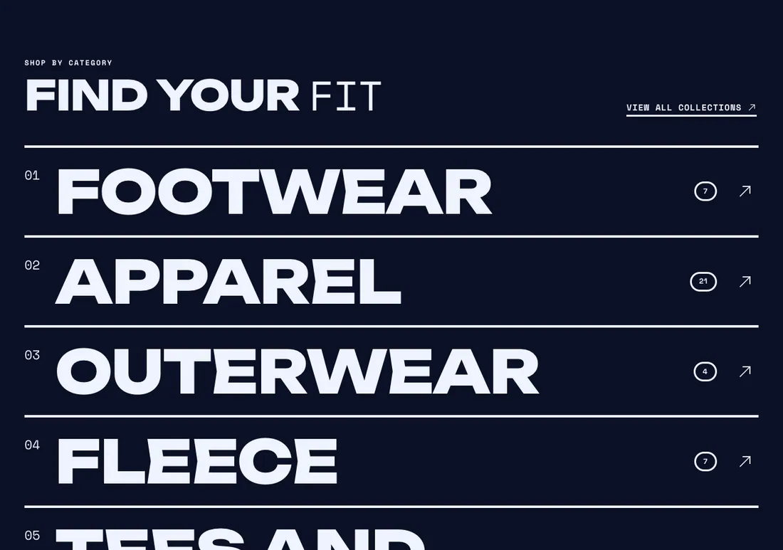
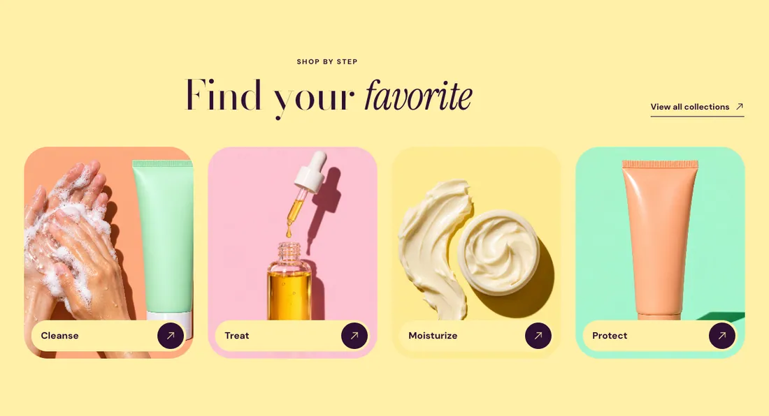
Where to find it: In the theme editor, choose Add section on any template, then pick Collection list.
The heading area is a static block named Section header. Select it in the section sidebar to edit the eyebrow, heading, text and buttons, or to restyle or reorder them.
When you add this section, you can start from these presets: Featured collections, Collection highlights, Collection name list.
Settings
Section titled “Settings”| Setting | Type | Default | Options | Notes |
|---|---|---|---|---|
| Collections | Collection list |
Header
Section titled “Header”| Setting | Type | Default | Options | Notes |
|---|---|---|---|---|
| Header link label | Text | View all collections | Links to the page that lists all collections. Leave empty to hide it. |
Layout
Section titled “Layout”| Setting | Type | Default | Options | Notes |
|---|---|---|---|---|
| Layout | Select | Tiles | Tiles, Mosaic (first tile large), Name list (large type) | |
| Columns on desktop | Slider | 4 | 2 to 5, step 1 | Shown when Layout is Tiles. |
| Columns on mobile | Select | 2 columns | 1 column, 2 columns | Shown when Layout is Tiles. |
| Image ratio | Select | Square (1:1) | Portrait (4:5), Square (1:1), Landscape (4:3) | Shown when Layout is not Name list (large type). |
| Name size | Select | Extra large | Medium, Large, Extra large, Huge | Shown when Layout is Name list (large type). |
| Divider line thickness | Slider | 4 px | 1 to 12 px, step 1 | Shown when Layout is Name list (large type). |
| Show row numbers | Checkbox | On | Shown when Layout is Name list (large type). | |
| Show product count | Checkbox | On | Shown when Layout is Name list (large type). | |
| Image follows the pointer | Checkbox | On | On touch screens the image shows inside the row. Shown when Layout is Name list (large type). |
Section style
Section titled “Section style”| Setting | Type | Default | Options | Notes |
|---|---|---|---|---|
| Color scheme | Color scheme | Scheme 1 | ||
| Layout width | Select | Page width | Page width, Full width | |
| Animation on scroll | Select | Theme default | Theme default, None, Fade, Slide up, Scale in, Wipe, Blur in | |
| Top padding | Slider | 80 px | 0 to 200 px, step 8 | |
| Bottom padding | Slider | 80 px | 0 to 200 px, step 8 |
Blocks
Section titled “Blocks”Add, reorder, duplicate or remove these blocks in the section sidebar: Section header.
Section header block settings
Section titled “Section header block settings”| Setting | Type | Default | Options | Notes |
|---|---|---|---|---|
| Layout | Select | Stacked | Stacked, Split: content left, button right | |
| Alignment | Select | Left | Left, Center, Right | Shown when Layout is Stacked. |
| Max width | Select | None | None, Narrow, Normal | |
| Gap | Slider | 12 px | 0 to 64 px, step 4 | |
| Space below | Slider | 48 px | 0 to 120 px, step 4 | |
| Animation on scroll | Select | None | Theme default, None, Fade, Slide up, Scale in, Wipe, Blur in |