Countdown section
Launch or sale countdown with large digits and a choice of what happens when it ends.
The same section in the three themes:
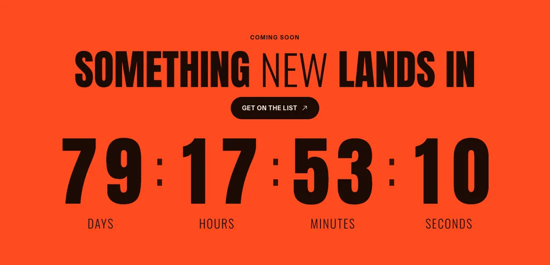
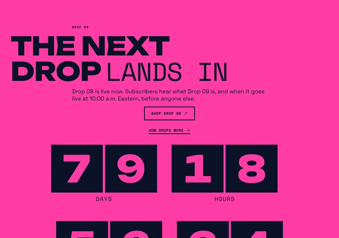
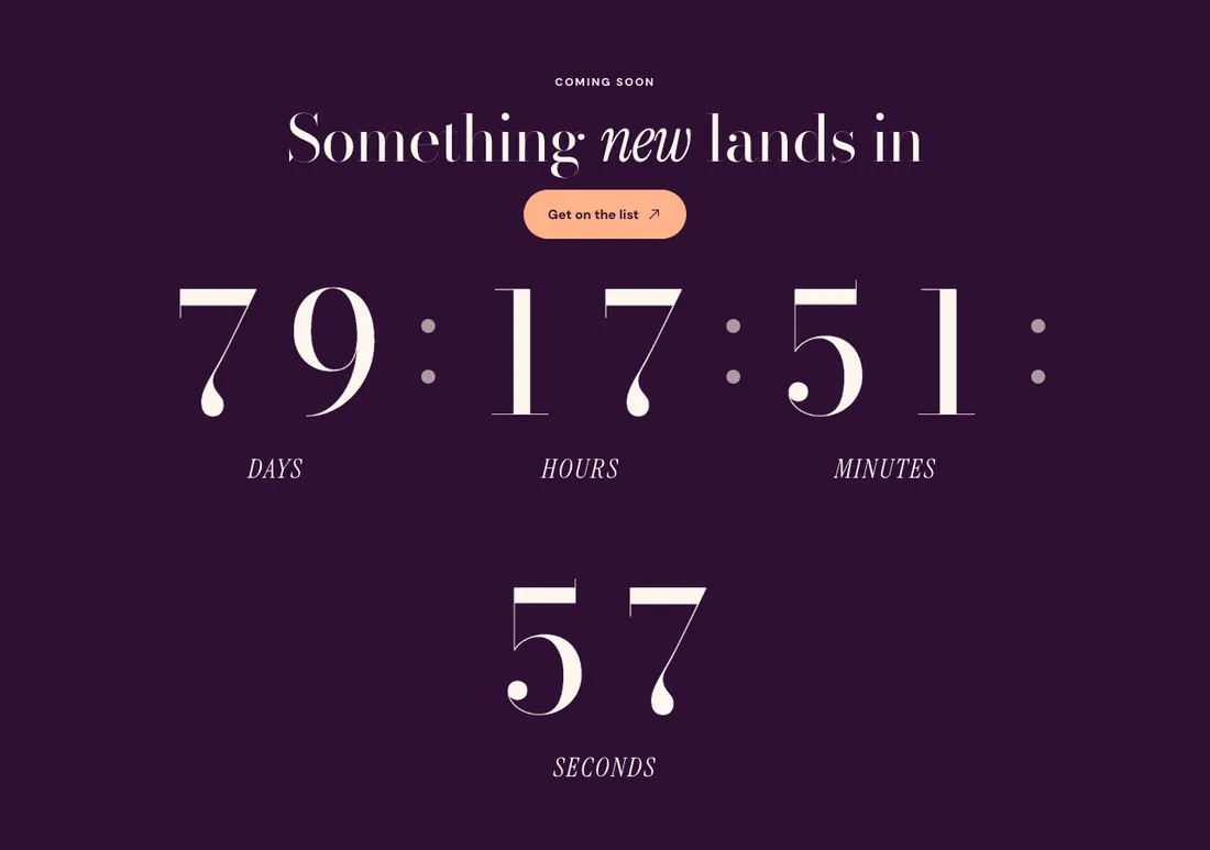
Where to find it: In the theme editor, choose Add section on any template, then pick Countdown.
When you add this section, you can start from these presets: Countdown, Countdown, split.
Settings
Section titled “Settings”Timing
Section titled “Timing”| Setting | Type | Default | Options | Notes |
|---|---|---|---|---|
| End date | Text | Format: YYYY-MM-DD, for example 2027-01-31. | ||
| End time | Text | 09:00 | 24-hour format HH:MM, in your store’s time zone (Settings > General). | |
| When time runs out | Select | Show a message | Hide the section, Show a message, Stay at zero | |
| Heading after the end | Inline text | The wait is over | Replaces the content blocks once time runs out, so the section stops promising what is already live. Leave empty to keep the blocks. Shown when When time runs out is Show a message. | |
| End message | Rich text | It is live. Go get it while it lasts. | Shown when When time runs out is Show a message. | |
| Button label | Text | Shown when When time runs out is Show a message. | ||
| Button link | Link | Shown when When time runs out is Show a message and Button label is on. |
Digits
Section titled “Digits”| Setting | Type | Default | Options | Notes |
|---|---|---|---|---|
| Show days | Checkbox | On | ||
| Show seconds | Checkbox | On | ||
| Show unit labels | Checkbox | On | ||
| Size | Select | Large | Small, Medium, Large, Extra large | |
| Style | Select | Solid | Solid, Accent color, Outline, Tiles | |
| Digit animation | Select | Roll | Roll, Flip, None | Follows the theme motion setting and a customer’s reduced motion preference. |
| Separator | Select | Colon | Colon, Dot, None |
Layout
Section titled “Layout”| Setting | Type | Default | Options | Notes |
|---|---|---|---|---|
| Layout | Select | Stacked | Stacked, Text beside timer | |
| Alignment | Select | Center | Left, Center, Right |
Section style
Section titled “Section style”| Setting | Type | Default | Options | Notes |
|---|---|---|---|---|
| Color scheme | Color scheme | Scheme 2 | ||
| Layout width | Select | Page width | Page width, Full width | |
| Animation on scroll | Select | Theme default | Theme default, None, Fade, Slide up, Scale in, Wipe, Blur in | |
| Top padding | Slider | 80 px | 0 to 200 px, step 8 | |
| Bottom padding | Slider | 80 px | 0 to 200 px, step 8 |
Blocks
Section titled “Blocks”You can also add any theme block (see Blocks) and app blocks to this section.