Slideshow section.
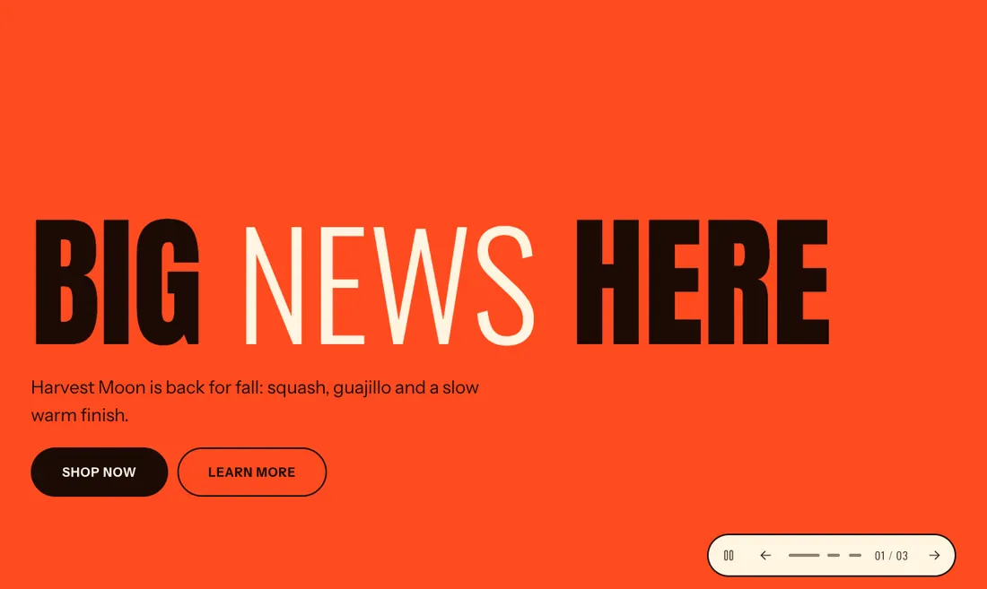
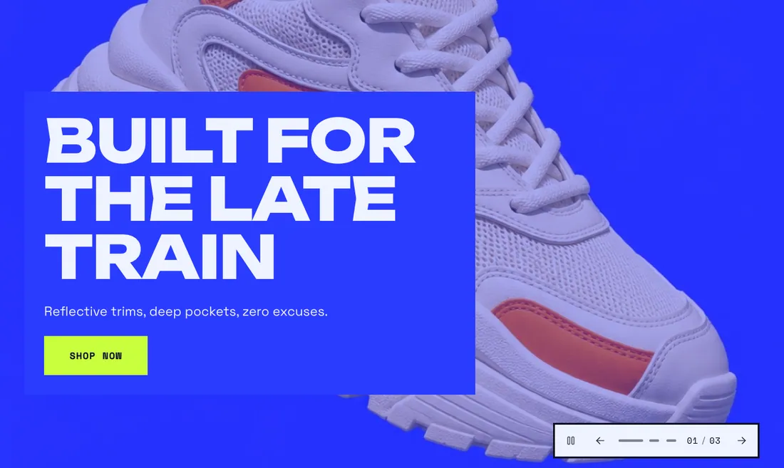
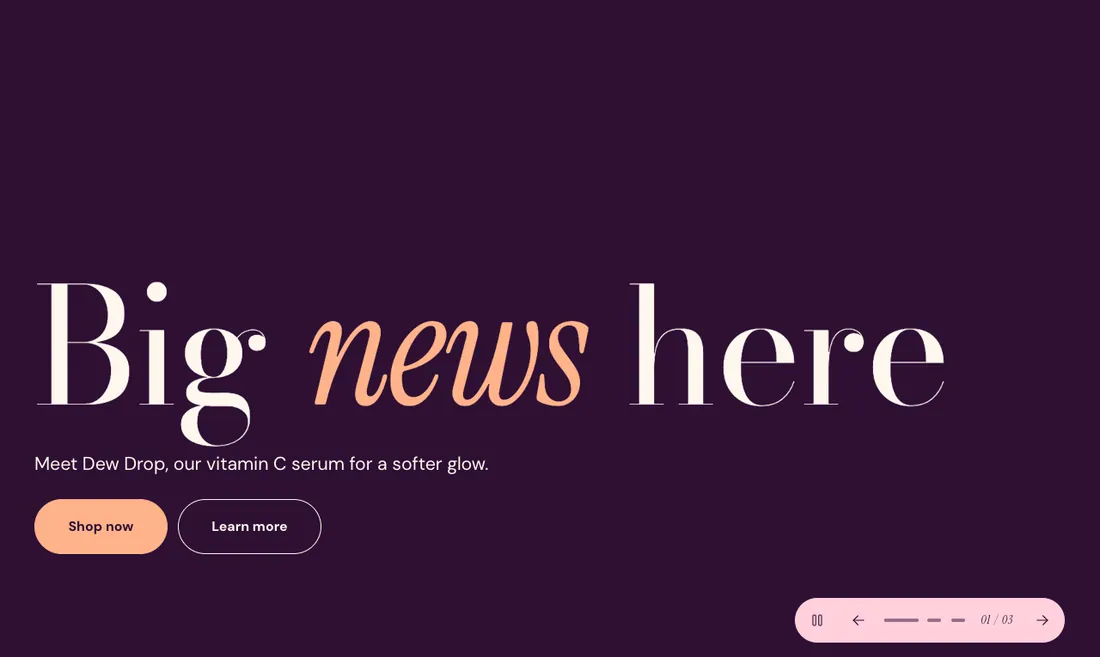
The same section in the three themes:
Picante styleOverdrive stylePastille style Where to find it: In the theme editor, choose Add section on any template, then pick Slideshow.
When you add this section, it starts from the Slideshow preset.
| Setting |
Type |
Default |
Options |
Notes |
| Height |
Select |
Large |
Small, Medium, Large, Full screen |
|
| Transition |
Select |
Slide |
Slide, Fade, Zoom |
|
| First slide heading |
Select |
H2 |
H1, H2 |
Use H1 only when the slideshow holds the main heading of the page. Other slides always use H2. |
| Setting |
Type |
Default |
Options |
Notes |
| Change slides automatically |
Checkbox |
Off |
|
Pauses on hover, on focus and off screen, and visitors can pause it. Stays off for visitors who ask for reduced motion and when theme motion is off. |
| Change slides every |
Slider |
6 s |
4 to 12 s, step 1 |
Shown when Change slides automatically is on. |
| Setting |
Type |
Default |
Options |
Notes |
| Show arrows |
Checkbox |
On |
|
|
| Show slide counter |
Checkbox |
On |
|
|
| Controls position |
Select |
Right |
Left, Center, Right |
|
| Setting |
Type |
Default |
Options |
Notes |
| Color scheme |
Color scheme |
Scheme 1 |
|
Colors the controls and the space around the slides. Each slide has its own color scheme. |
| Layout width |
Select |
Full width |
Page width, Full width |
|
| Animation on scroll |
Select |
Theme default |
Theme default, None, Fade, Slide up, Scale in, Wipe, Blur in |
|
| Top padding |
Slider |
0 px |
0 to 200 px, step 8 |
|
| Bottom padding |
Slider |
0 px |
0 to 200 px, step 8 |
|
Add, reorder, duplicate or remove these blocks in the section sidebar: Slide.
This section holds up to 8 blocks.
| Setting |
Type |
Default |
Options |
Notes |
| Background |
Select |
Image |
Image, Video, Color only |
|
| Video |
Video |
|
|
Plays muted on a loop while the slide shows. The image shows until the video starts. Shown when Background is Video. |
| Image |
Image |
|
|
Shown behind the content. With a video, it shows until the video starts. Shown when Background is not Color only. |
| Mobile image |
Image |
|
|
Optional. Shown on screens narrower than 750px. Shown when Background is not Color only. |
| Overlay opacity |
Slider |
20 % |
0 to 90 %, step 5 |
Shown when Background is not Color only. |
| Setting |
Type |
Default |
Options |
Notes |
| Heading |
Inline text |
Make it loud |
|
Set words in italics to show them in the accent font. |
| Heading size |
Select |
Heading 1 |
Fit to width, Extra large heading, Heading 1, Heading 2, Heading 3 |
|
| Text |
Rich text |
Tell customers what this slide is about in one short line. |
|
|
| Button label |
Text |
Shop now |
|
|
| Button link |
Link |
|
|
Shown when Button label is on. |
| Button style |
Select |
Solid |
Solid, Outline, Text link |
Shown when Button label is on. |
| Second button label |
Text |
|
|
|
| Second button link |
Link |
|
|
Shown when Second button label is on. |
| Second button style |
Select |
Outline |
Solid, Outline, Text link |
Shown when Second button label is on. |
| Setting |
Type |
Default |
Options |
Notes |
| Position |
Select |
Bottom left |
Top left, Top center, Top right, Middle left, Middle center, Middle right, Bottom left, Bottom center, Bottom right |
|
| Content width |
Select |
Normal |
Narrow, Normal, Wide |
|
| Text background |
Select |
None |
None, Solid panel |
|
| Color scheme |
Color scheme |
Scheme 2 |
|
Sets the background when there is no image, the overlay color and the text color. |