Skip to content

FAQ section

Your theme

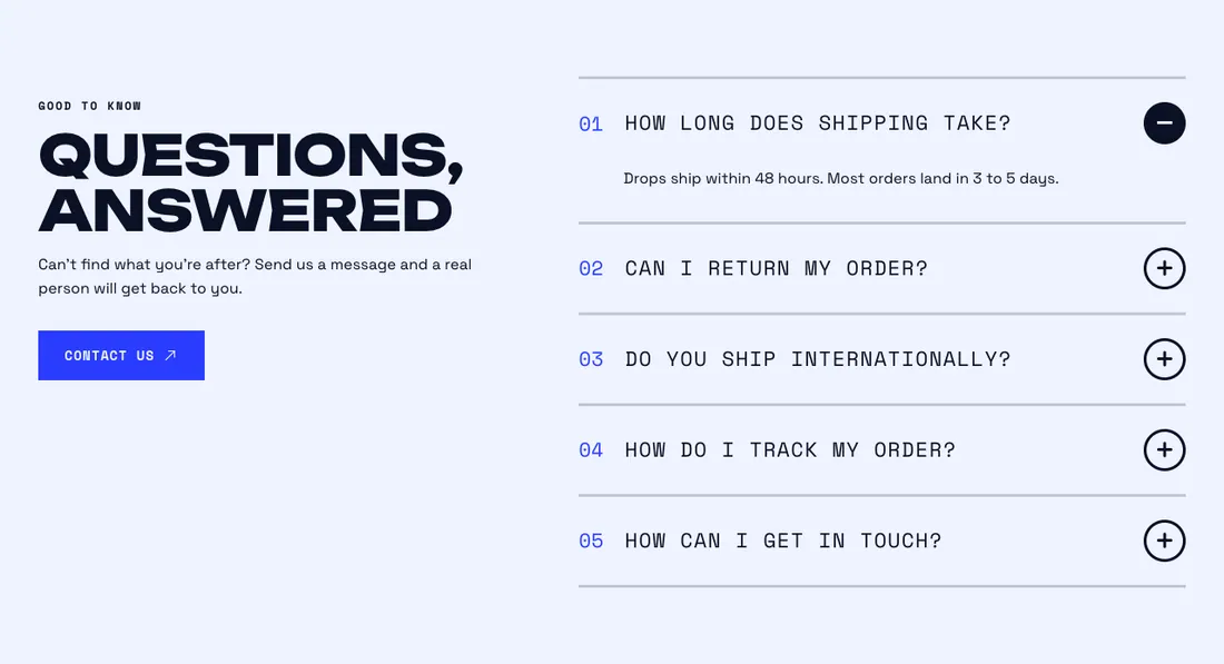
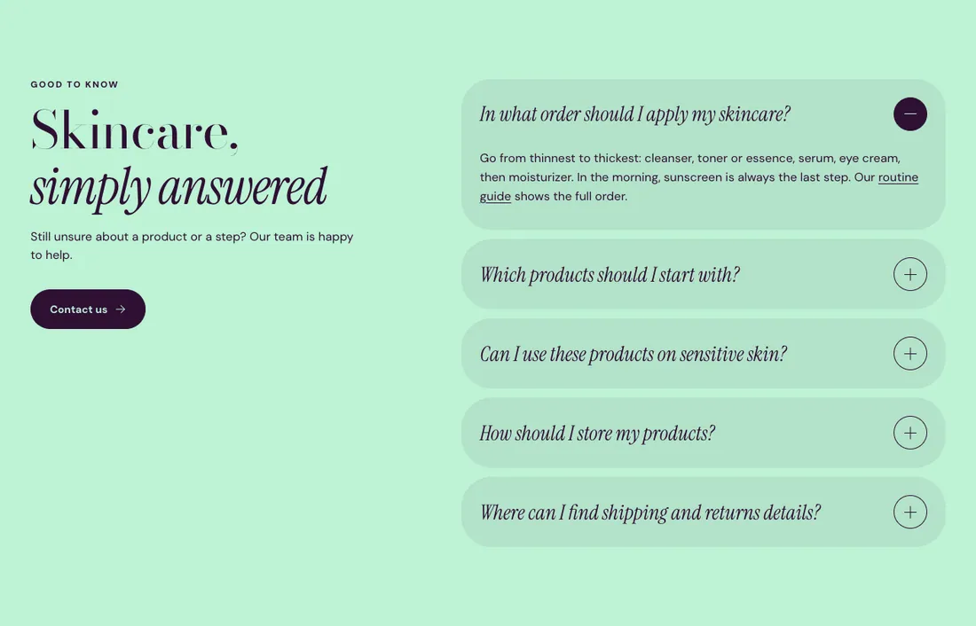
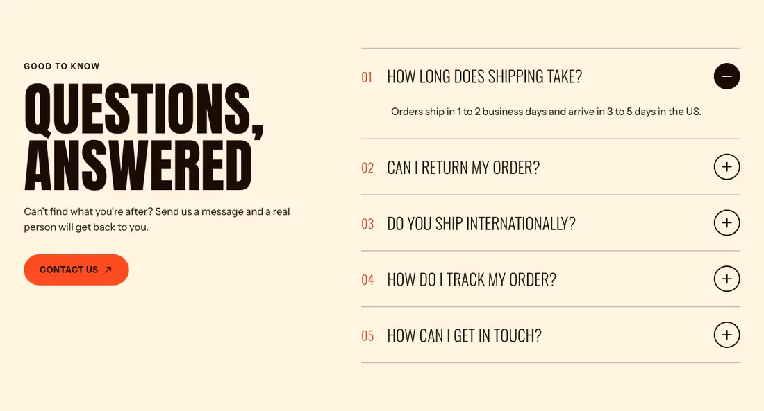
Animated accordion with numbering and FAQPage structured data.

The same section in the three themes:

Where to find it: In the theme editor, choose Add section on any template, then pick FAQ.

The heading area is a static block named Section header. Select it in the section sidebar to edit the eyebrow, heading, text and buttons, or to restyle or reorder them.

When you add this section, it starts from the FAQ preset.

Setting Type Default Options Notes
Layout Select Split with sticky heading Split with sticky heading, Stacked Split keeps the heading in view beside the questions on desktop.
Alignment Select Center Left, Center, Right Shown when Layout is Stacked.
Style Select Divider lines Divider lines, Cards
Show question numbers Checkbox On
Open one answer at a time Checkbox On
Add FAQ structured data Checkbox Off Off by default. Turn it on once the questions and answers here are your own, on one FAQ section per page. Leave it off for questions repeated on many pages.
Setting Type Default Options Notes
Color scheme Color scheme Scheme 1
Layout width Select Page width Page width, Full width
Animation on scroll Select Theme default Theme default, None, Fade, Slide up, Scale in, Wipe, Blur in
Top padding Slider 80 px 0 to 200 px, step 8
Bottom padding Slider 80 px 0 to 200 px, step 8

Add, reorder, duplicate or remove these blocks in the section sidebar: Section header, Question.

This section holds up to 40 blocks.

Setting Type Default Options Notes
Layout Select Stacked Stacked, Split: content left, button right
Alignment Select Left Left, Center, Right Shown when Layout is Stacked.
Max width Select None None, Narrow, Normal
Gap Slider 12 px 0 to 64 px, step 4
Space below Slider 48 px 0 to 120 px, step 4
Animation on scroll Select None Theme default, None, Fade, Slide up, Scale in, Wipe, Blur in
Setting Type Default Options Notes
Question Text How long does shipping take?
Answer Rich text Share your typical processing and delivery times here.
Open by default Checkbox Off
Setting Type Default Options Notes
Text style Select Heading 5 Intro text, Heading 6, Heading 5, Heading 4, Heading 3
Text color Select Color scheme text Color scheme text, Accent, Custom
Custom text color Color Shown when Text color is Custom.
Setting Type Default Options Notes
Inherit color scheme Checkbox On
Color scheme Color scheme Scheme 1 Shown when Inherit color scheme is off.
Corner radius Slider 0 px 0 to 80 px, step 2
Border Select None None, Solid, Dashed
Border thickness Slider 2 px 1 to 8 px, step 1 Shown when Border is not None.
Setting Type Default Options Notes
Customize padding Checkbox Off Padding settings stay visible while any side has padding. Set a side to 0px to remove its padding.
Top padding Slider 0 px 0 to 100 px, step 2 Shown when Customize padding is on or Top padding is on or Bottom padding is on or Left padding is on or Right padding is on.
Bottom padding Slider 0 px 0 to 100 px, step 2 Shown when Customize padding is on or Top padding is on or Bottom padding is on or Left padding is on or Right padding is on.
Left padding Slider 0 px 0 to 100 px, step 2 Shown when Customize padding is on or Top padding is on or Bottom padding is on or Left padding is on or Right padding is on.
Right padding Slider 0 px 0 to 100 px, step 2 Shown when Customize padding is on or Top padding is on or Bottom padding is on or Left padding is on or Right padding is on.
Setting Type Default Options Notes
Animation on scroll Select Theme default Theme default, None, Fade, Slide up, Scale in, Wipe, Blur in