Image gallery section
Draggable shelf of cards in a fanned arc, wave or straight row.
The same section in the three themes:
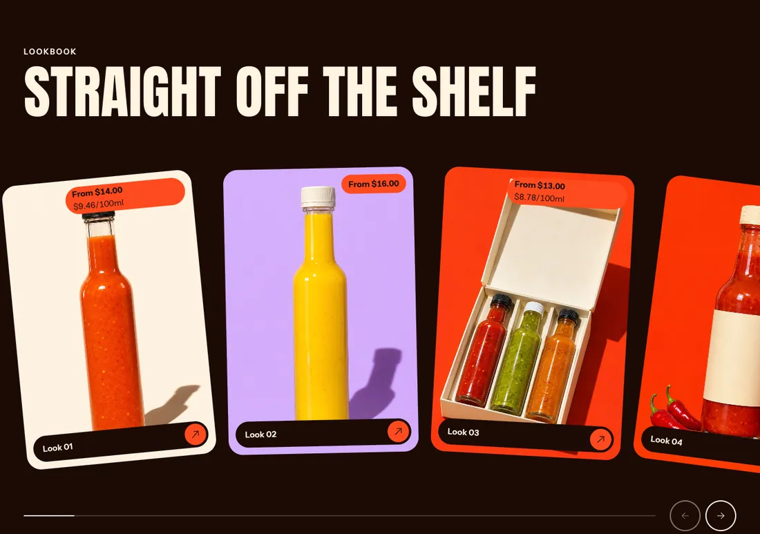
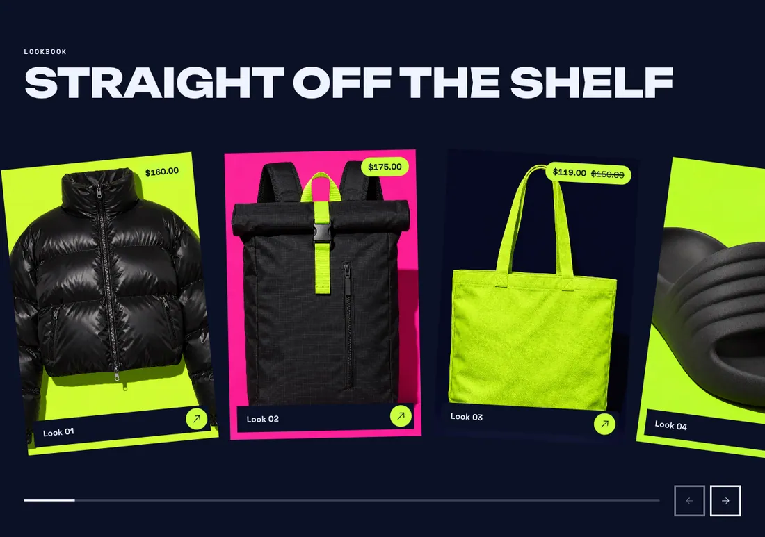
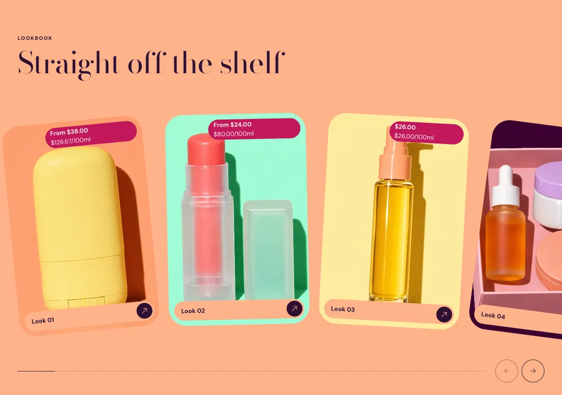
Where to find it: In the theme editor, choose Add section on any template, then pick Image gallery.
The heading area is a static block named Section header. Select it in the section sidebar to edit the eyebrow, heading, text and buttons, or to restyle or reorder them.
When you add this section, you can start from these presets: Image gallery, Image gallery, staggered.
Settings
Section titled “Settings”Gallery
Section titled “Gallery”| Setting | Type | Default | Options | Notes |
|---|---|---|---|---|
| Style | Select | Fan | Fan, Wave, Straight | |
| Effect strength | Slider | 5 | 1 to 10, step 1 | Sets how far the cards rotate in the fan or shift in the wave. Shown when Style is not Straight. |
| Card width | Slider | 320 px | 200 to 520 px, step 20 | |
| Card shape | Select | Tall | Square (1:1), Portrait (4:5), Tall, Extra tall | |
| Gap | Slider | 24 px | 0 to 64 px, step 4 | |
| Alignment | Select | Left | Left, Center, Right | |
| Caption position | Select | On the image | On the image, Below the image | |
| Show arrows | Checkbox | On | ||
| Show progress bar | Checkbox | On |
Section style
Section titled “Section style”| Setting | Type | Default | Options | Notes |
|---|---|---|---|---|
| Color scheme | Color scheme | Scheme 3 | ||
| Layout width | Select | Page width | Page width, Full width | |
| Animation on scroll | Select | Theme default | Theme default, None, Fade, Slide up, Scale in, Wipe, Blur in | |
| Top padding | Slider | 80 px | 0 to 200 px, step 8 | |
| Bottom padding | Slider | 80 px | 0 to 200 px, step 8 |
Blocks
Section titled “Blocks”Add, reorder, duplicate or remove these blocks in the section sidebar: Section header, Gallery card.
This section holds up to 12 blocks.
Section header block settings
Section titled “Section header block settings”| Setting | Type | Default | Options | Notes |
|---|---|---|---|---|
| Layout | Select | Stacked | Stacked, Split: content left, button right | |
| Alignment | Select | Left | Left, Center, Right | Shown when Layout is Stacked. |
| Max width | Select | None | None, Narrow, Normal | |
| Gap | Slider | 12 px | 0 to 64 px, step 4 | |
| Space below | Slider | 48 px | 0 to 120 px, step 4 | |
| Animation on scroll | Select | None | Theme default, None, Fade, Slide up, Scale in, Wipe, Blur in |
Gallery card block settings
Section titled “Gallery card block settings”| Setting | Type | Default | Options | Notes |
|---|---|---|---|---|
| Image | Image | |||
| Caption | Text | Leave empty to use the product name. | ||
| Link | Link | |||
| Product | Product | Fills in the image, caption and link when those are empty. | ||
| Show product price | Checkbox | On |
Colors and border
Section titled “Colors and border”| Setting | Type | Default | Options | Notes |
|---|---|---|---|---|
| Corner radius | Slider | 0 px | 0 to 80 px, step 2 | |
| Border | Select | None | None, Solid, Dashed | |
| Border thickness | Slider | 2 px | 1 to 8 px, step 1 | Shown when Border is not None. |
Motion
Section titled “Motion”| Setting | Type | Default | Options | Notes |
|---|---|---|---|---|
| Animation on scroll | Select | Theme default | Theme default, None, Fade, Slide up, Scale in, Wipe, Blur in |