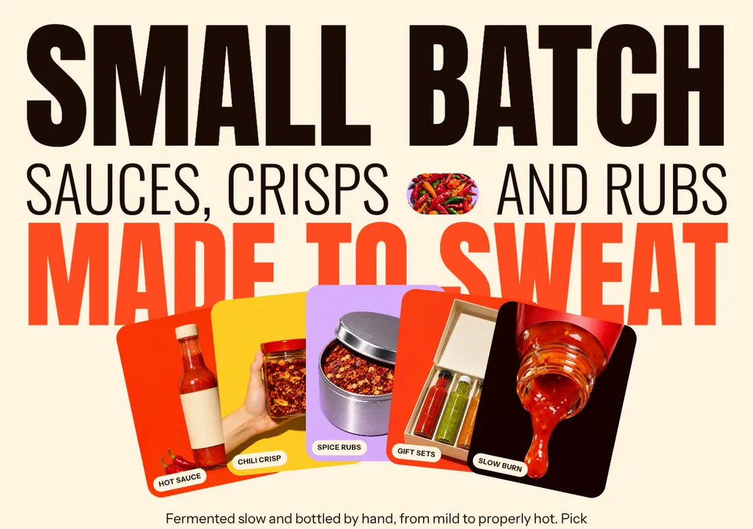
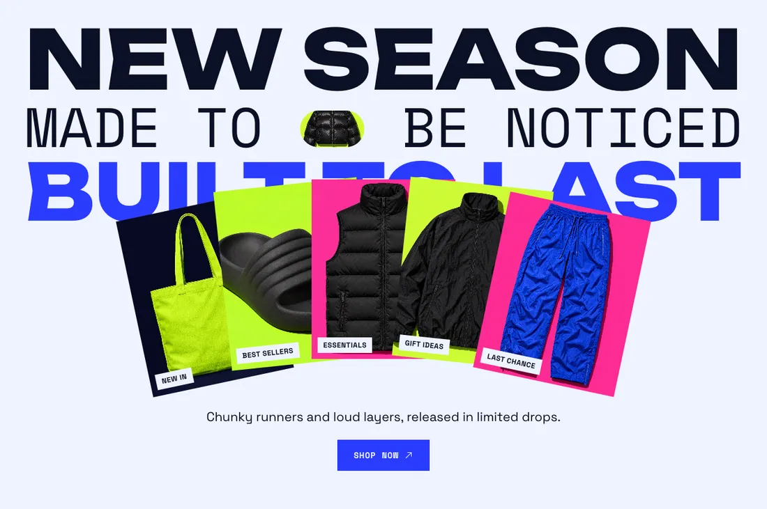
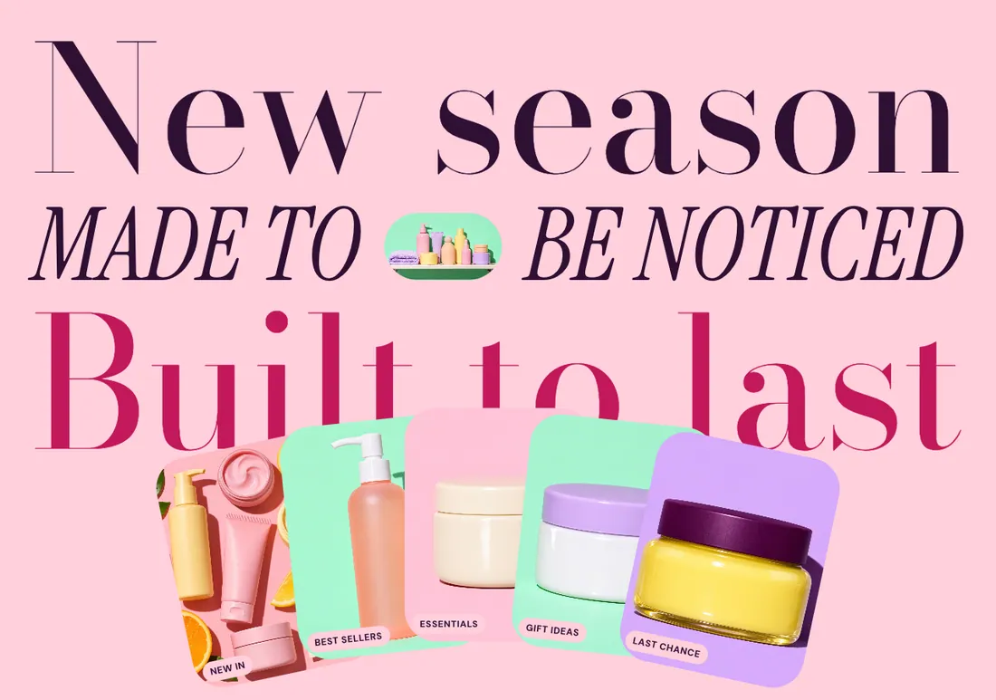
Giant stacked headline lines fitted to the full width, alternating heavy / thin / outline faces, with inline image pills and a fanned shelf of cards.
The same section in the three themes:
Picante styleOverdrive stylePastille style Where to find it: In the theme editor, choose Add section on any template, then pick Hero banner.
When you add this section, you can start from these presets: Hero banner, Hero banner, text only.
| Setting |
Type |
Default |
Options |
Notes |
| HTML tag |
Select |
Heading 2 |
Heading 1, Heading 2, Plain text |
Screen readers read the lines as one heading. Use heading 1 only when this is the first section on the home page. |
| Space between lines |
Slider |
0 px |
0 to 40 px, step 2 |
|
| Largest fitted size |
Slider |
0 px |
0 to 400 px, step 10 |
Set to 0 for no limit. |
| Headline load animation |
Select |
Rise from below |
Rise from below, Wipe across, None |
|
| Setting |
Type |
Default |
Options |
Notes |
| Card layout |
Select |
Fan |
Fan, Straight row, Stacked pile, No cards |
Add image card blocks to fill this row. The section shows up to 8 cards. |
| Card position |
Select |
Overlapping the headline |
Below the headline, Overlapping the headline |
Shown when Card layout is not No cards. |
| Image ratio |
Select |
Portrait (4:5) |
Portrait (4:5), Square (1:1), Landscape (4:3) |
Shown when Card layout is not No cards. |
| Card size |
Slider |
20 % |
10 to 40 %, step 2 |
Shown when Card layout is not No cards. |
| Drift images on scroll |
Checkbox |
On |
|
Shown when Card layout is not No cards. |
| Setting |
Type |
Default |
Options |
Notes |
| Minimum height |
Slider |
0 svh |
0 to 100 svh, step 10 |
|
| Text and buttons position |
Select |
Below the cards |
Above the headline, Between headline and cards, Below the cards |
When the cards overlap the headline, the middle position moves below the cards. |
| Alignment |
Select |
Center |
Left, Center, Right |
|
| Setting |
Type |
Default |
Options |
Notes |
| Color scheme |
Color scheme |
Scheme 1 |
|
|
| Layout width |
Select |
Full width |
Page width, Full width |
|
| Animation on scroll |
Select |
Theme default |
Theme default, None, Fade, Slide up, Scale in, Wipe, Blur in |
|
| Top padding |
Slider |
32 px |
0 to 200 px, step 8 |
|
| Bottom padding |
Slider |
64 px |
0 to 200 px, step 8 |
|
Add, reorder, duplicate or remove these blocks in the section sidebar: Headline line, Image card.
You can also add any theme block (see Blocks) and app blocks to this section.
| Setting |
Type |
Default |
Options |
Notes |
| Text |
Text |
Make it bold |
|
|
| Font |
Select |
Heading |
Heading, Accent, Heading font, outline |
|
| Text color |
Select |
Color scheme text |
Color scheme text, Accent |
|
| Setting |
Type |
Default |
Options |
Notes |
| Show an image inside the line |
Checkbox |
Off |
|
The image sits between two words and scales with the text. |
| Image |
Image |
|
|
Shown when Show an image inside the line is on. |
| Place after word |
Slider |
1 |
0 to 8, step 1 |
0 puts the image before the first word. Shown when Show an image inside the line is on. |
| Image shape |
Select |
Pill |
Pill, Circle, Rounded card |
Shown when Show an image inside the line is on. |
| Setting |
Type |
Default |
Options |
Notes |
| Customize padding |
Checkbox |
Off |
|
Padding settings stay visible while any side has padding. Set a side to 0px to remove its padding. |
| Top padding |
Slider |
0 px |
0 to 100 px, step 2 |
Shown when Customize padding is on or Top padding is on or Bottom padding is on. |
| Bottom padding |
Slider |
0 px |
0 to 100 px, step 2 |
Shown when Customize padding is on or Top padding is on or Bottom padding is on. |
| Setting |
Type |
Default |
Options |
Notes |
| Image |
Image |
|
|
|
| Link |
Link |
|
|
|
| Caption |
Text |
|
|
|
| Extra rotation |
Slider |
0 deg |
-15 to 15 deg, step 1 |
Adds to the angle the card layout sets for this card. |
| Move up or down |
Slider |
0 px |
-60 to 60 px, step 4 |
|