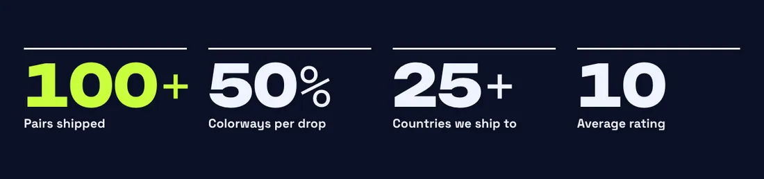
Count-up numbers with prefix / suffix faces and dividers.
The same section in the three themes:
Picante styleOverdrive stylePastille style Where to find it: In the theme editor, choose Add section on any template, then pick Stats.
When you add this section, you can start from these presets: Stats, Stats with heading.
| Setting |
Type |
Default |
Options |
Notes |
| Columns on desktop |
Slider |
4 |
1 to 6, step 1 |
|
| Columns on mobile |
Slider |
2 |
1 to 3, step 1 |
|
| Gap |
Slider |
40 px |
0 to 100 px, step 4 |
|
| Alignment |
Text alignment |
left |
Left, center, right |
|
| Dividers |
Select |
Line above each number |
None, Lines between columns, Line above each number |
|
| Setting |
Type |
Default |
Options |
Notes |
| Size |
Select |
Large |
Small, Medium, Large, Extra large |
Numbers shrink on their own when a column is too narrow to hold them. |
| Font |
Select |
Heading |
Heading, Accent, Body |
|
| Count-up duration |
Slider |
1600 ms |
400 to 4000 ms, step 200 |
Numbers roll up from zero the first time they scroll into view. |
| Setting |
Type |
Default |
Options |
Notes |
| Color scheme |
Color scheme |
Scheme 3 |
|
|
| Layout width |
Select |
Page width |
Page width, Full width |
|
| Animation on scroll |
Select |
Theme default |
Theme default, None, Fade, Slide up, Scale in, Wipe, Blur in |
|
| Top padding |
Slider |
80 px |
0 to 200 px, step 8 |
|
| Bottom padding |
Slider |
80 px |
0 to 200 px, step 8 |
|
Add, reorder, duplicate or remove these blocks in the section sidebar: Stat.
You can also add any theme block (see Blocks) and app blocks to this section.
| Setting |
Type |
Default |
Options |
Notes |
| Number |
Number |
100 |
|
Keeps decimals, for example 4.9. |
| Group thousands (1,200) |
Checkbox |
On |
|
|
| Prefix |
Text |
|
|
|
| Suffix |
Text |
+ |
|
|
| Prefix and suffix style |
Select |
Thin accent font |
Same as the number, Thin accent font, Small, raised |
|
| Label |
Text |
Add a stat label |
|
|
| Text |
Rich text |
|
|
|
| Number color |
Select |
Color scheme text |
Color scheme text, Accent, Custom |
|
| Custom text color |
Color |
|
|
Shown when Number color is Custom. |
| Setting |
Type |
Default |
Options |
Notes |
| Inherit color scheme |
Checkbox |
On |
|
|
| Color scheme |
Color scheme |
Scheme 3 |
|
Shown when Inherit color scheme is off. |
| Corner radius |
Slider |
0 px |
0 to 80 px, step 2 |
|
| Border |
Select |
None |
None, Solid, Dashed |
|
| Border thickness |
Slider |
2 px |
1 to 8 px, step 1 |
Shown when Border is not None. |
| Setting |
Type |
Default |
Options |
Notes |
| Customize padding |
Checkbox |
Off |
|
Padding settings stay visible while any side has padding. Set a side to 0px to remove its padding. |
| Top padding |
Slider |
0 px |
0 to 100 px, step 2 |
Shown when Customize padding is on or Top padding is on or Bottom padding is on or Left padding is on or Right padding is on. |
| Bottom padding |
Slider |
0 px |
0 to 100 px, step 2 |
Shown when Customize padding is on or Top padding is on or Bottom padding is on or Left padding is on or Right padding is on. |
| Left padding |
Slider |
0 px |
0 to 100 px, step 2 |
Shown when Customize padding is on or Top padding is on or Bottom padding is on or Left padding is on or Right padding is on. |
| Right padding |
Slider |
0 px |
0 to 100 px, step 2 |
Shown when Customize padding is on or Top padding is on or Bottom padding is on or Left padding is on or Right padding is on. |
| Setting |
Type |
Default |
Options |
Notes |
| Animation on scroll |
Select |
Theme default |
Theme default, None, Fade, Slide up, Scale in, Wipe, Blur in |
|