Blank section that accepts any theme or app blocks in a row or column layout.
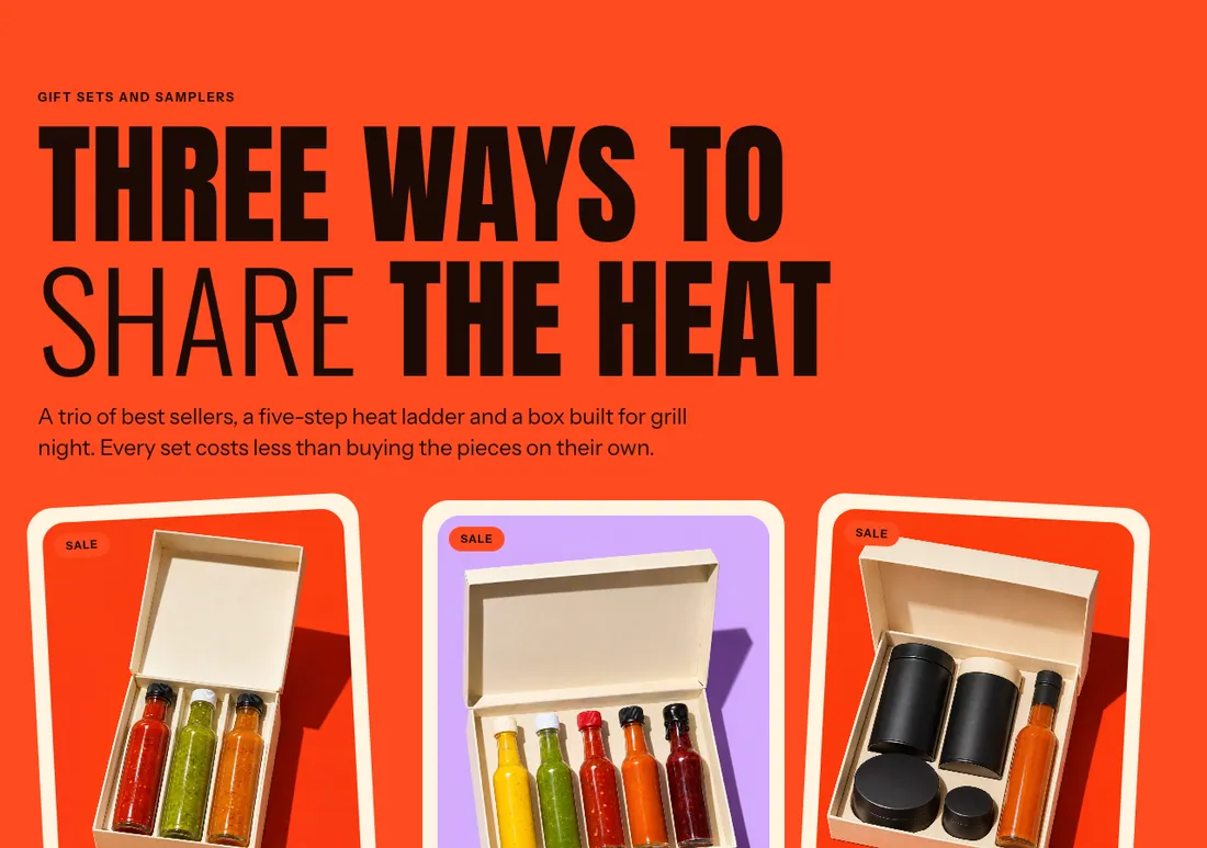
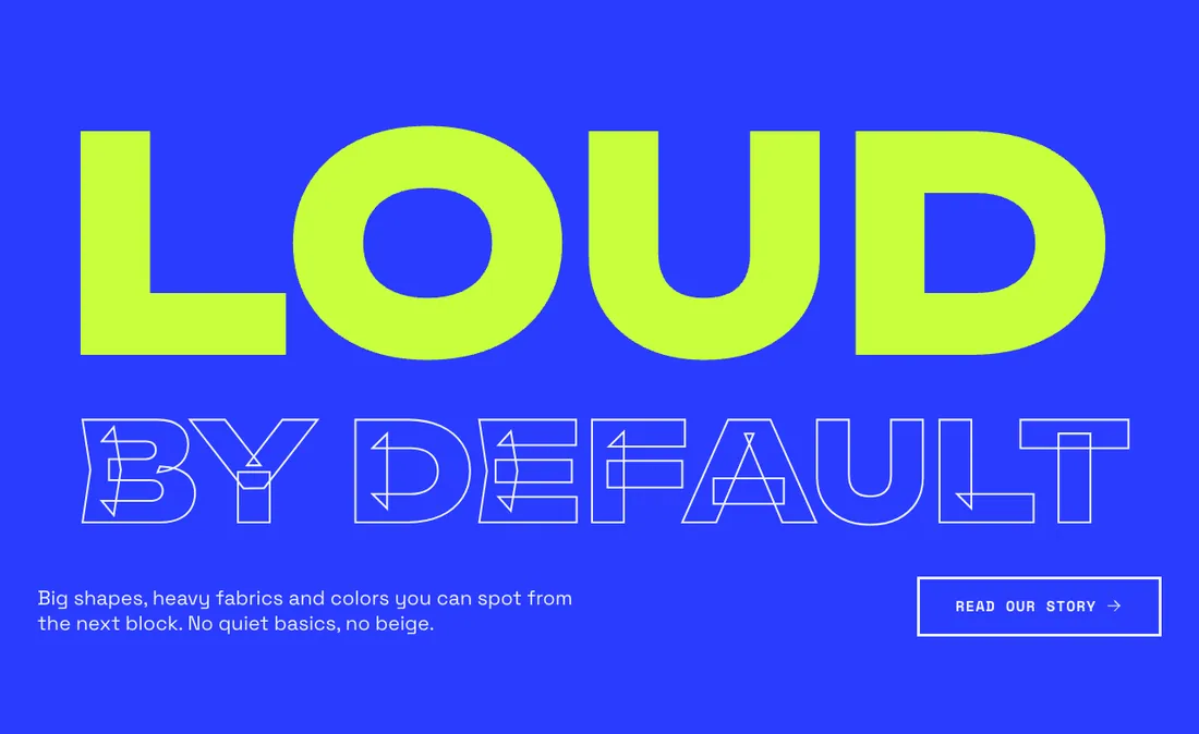
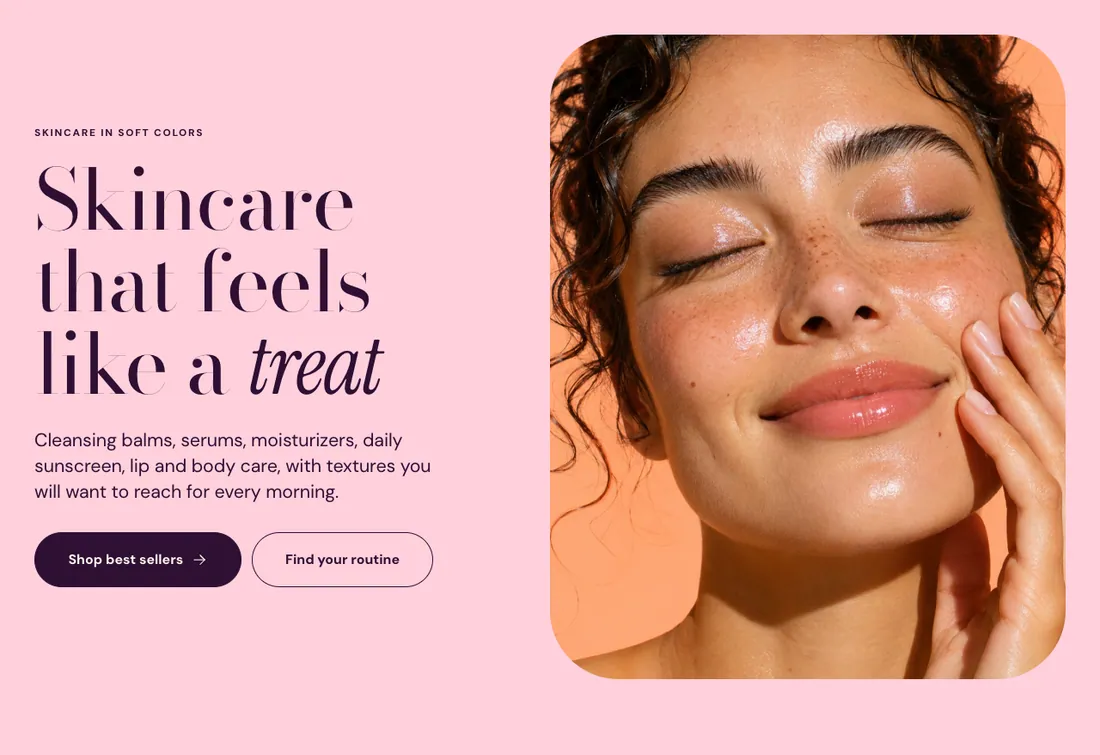
The same section in the three themes:
Picante style
Overdrive style
Pastille style
Where to find it: In the theme editor, choose Add section on any template, then pick Custom section.
When you add this section, you can start from these presets: Custom section, Columns with color backgrounds, Story with media, Features with icons, Video banner, Large heading with text, Newsletter band, Questions and answers, Product with story, Store highlights, Shop the collection, Social media and contact.
Plays muted on a loop with a pause button. The image shows first, and stays for customers who prefer reduced motion.
Show placeholder image
Checkbox
Off
Previews the layout with a sample image until you select an image or video. Customers see the sample image too, so add your own before you publish. Shown when Image is on and Video is on.
Drift images on scroll
Checkbox
On
Shown when Image is on and Video is on.
Overlay opacity
Slider
40 %
0 to 90 %, step 5
Tints the image with the section background color so content stays readable. Shown when Image is on or Video is on or Show placeholder image is on.
Overlay color
Color
Leave empty to use the color scheme background. Shown when Image is on or Video is on or Show placeholder image is on.
Overlay text color
Color
Text color on top of the background image or video. Leave empty to use the color scheme text. Shown when Image is on or Video is on or Show placeholder image is on.
Overlay style
Select
Solid
Solid, Gradient
Shown when Image is on or Video is on or Show placeholder image is on.
Gradient strongest at
Select
Bottom
Bottom, Top, Left, Right
Shown when Overlay style is Gradient and Image is on and Video is on and Show placeholder image is on.