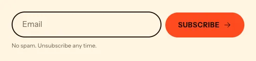
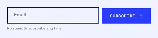
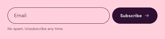
An email signup field that adds subscribers to your Shopify customer list.
Where to find it: open any section sidebar that accepts theme blocks, choose Add block, then pick Email signup.
The same block in the three themes:
Picante styleOverdrive stylePastille style When you add this section, you can start from these presets: Email signup, Email signup, round button.
Adds subscribers to your customer list with the newsletter tag.
| Setting |
Type |
Default |
Options |
Notes |
| Layout |
Select |
Field and button side by side |
Field and button side by side, Button under field |
Side by side stacks by itself when the block is narrow. |
| Alignment |
Text alignment |
left |
Left, center, right |
|
| Setting |
Type |
Default |
Options |
Notes |
| Field label |
Select |
Inside the field, floats up |
Inside the field, floats up, Above the field, Hidden, for screen readers only |
|
| Label text |
Text |
|
|
Leave empty to use “Email”. |
| Placeholder text |
Text |
|
|
Shows an example in the empty field. Leave empty for the default. Shown when Field label is not Inside the field, floats up. |
| Setting |
Type |
Default |
Options |
Notes |
| Button label |
Text |
|
|
|
| Button content |
Select |
Text |
Text, Round icon only |
|
| Button style |
Select |
Solid |
Solid, Outline, Text link |
|
| Size |
Select |
Medium |
Small, Medium, Large |
Shown when Button content is not Round icon only. |
| Icon |
Select |
Arrow right |
None, Arrow right, Arrow up right, Plus, Flame, Sparkle |
|
| Button follows the pointer |
Checkbox |
On |
|
The button leans toward the pointer on hover. |
| Setting |
Type |
Default |
Options |
Notes |
| Success message |
Text |
|
|
Leave empty to use the default message. |
| Small print |
Inline text |
No spam. Unsubscribe any time. |
|
|
| Preview success message |
Checkbox |
Off |
|
Shows the thank-you state in the theme editor only, so you can style it. |
| Setting |
Type |
Default |
Options |
Notes |
| Width |
Select |
Fill |
Fit content, Fill, Custom |
|
| Custom width |
Slider |
50 % |
10 to 100 %, step 5 |
Shown when Width is Custom. |
| Max width |
Select |
Narrow |
None, Narrow, Normal, Wide |
|
| Setting |
Type |
Default |
Options |
Notes |
| Inherit color scheme |
Checkbox |
On |
|
|
| Color scheme |
Color scheme |
Scheme 1 |
|
Shown when Inherit color scheme is off. |
| Border |
Select |
None |
None, Solid, Dashed |
|
| Border thickness |
Slider |
2 px |
1 to 8 px, step 1 |
Shown when Border is not None. |
| Corner radius |
Slider |
0 px |
0 to 80 px, step 2 |
Shown when Inherit color scheme is off or Border is not None or Corner radius is on. |
| Setting |
Type |
Default |
Options |
Notes |
| Customize padding |
Checkbox |
Off |
|
Padding settings stay visible while any side has padding. Set a side to 0px to remove its padding. |
| Top padding |
Slider |
0 px |
0 to 100 px, step 2 |
Shown when Customize padding is on or Top padding is on or Bottom padding is on or Left padding is on or Right padding is on. |
| Bottom padding |
Slider |
0 px |
0 to 100 px, step 2 |
Shown when Customize padding is on or Top padding is on or Bottom padding is on or Left padding is on or Right padding is on. |
| Left padding |
Slider |
0 px |
0 to 100 px, step 2 |
Shown when Customize padding is on or Top padding is on or Bottom padding is on or Left padding is on or Right padding is on. |
| Right padding |
Slider |
0 px |
0 to 100 px, step 2 |
Shown when Customize padding is on or Top padding is on or Bottom padding is on or Left padding is on or Right padding is on. |
| Setting |
Type |
Default |
Options |
Notes |
| Animation on scroll |
Select |
Theme default |
Theme default, None, Fade, Slide up, Scale in, Wipe, Blur in |
|